
This second installment explores how to effectively represent changes in projects, highlighting what has changed in a given period of time. To do so, we will use differential approaches to two fundamental project management tools: Work Breakdown Structures and GANTT charts.
Work Breakdown Structure: from comprehensive to focused
The standard WBS provides a snapshot of current project status. Even with visualization optimizations like collapsing completed tasks and color-coded task statuses, any moderately complex project displays numerous active work streams.

While the WBS above shows current project status comprehensively, identifying what changed during a specific period requires filtering through extensive visual information. The challenge lies in distinguishing actual progress from static project elements, the signal from the noise.
The Delta WBS addresses this by showing only tasks that changed status during the reporting period, that is items completed, initiated, or modified.

This approach differs significantly from Sprint board Done columns, which provide flat task lists without hierarchical context. The Delta WBS maintains project structure by including parent tasks up to the root level, rendered in subdued colors and smaller sizes to provide context without overwhelming the primary focus. Comparing the Delta WBS with the complete version reveals that only one Initiative shows active development, with work concentrated in specific Epics within that Initiative.
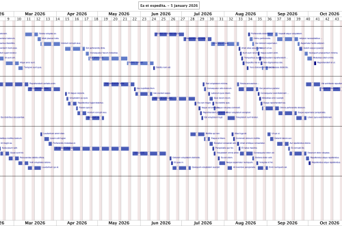
GANTT charts: streamlining timeline analysis
Traditional GANTT charts present similar challenges: comprehensive information that makes change identification difficult. These charts display complete project timelines: every task, dependency, and milestone across the entire project duration.

While thorough, answering “what changed this month?” requires timeline analysis and comparison with previous versions. The cognitive load of processing complete project timelines often obscures the specific changes stakeholders need to understand.
The Delta GANTT eliminates this complexity by displaying only elements that shifted during the reporting period. Did Task A slip by two weeks? It’s there. Did someone add a new dependency that’s now blocking three other tasks? You’ll see it immediately.

Delta GANTTs excel at revealing scope creep impact. When additional scope is added to stories, the visualization shows how these additions cascade through Epic timelines. A single new requirement or dependency can shift entire Epic delivery schedules, and the Delta GANTT makes these ripple effects transparent.
The Delta GANTT above demonstrates this focused approach: instead of analyzing dozens of timeline elements, you can immediately identify which tasks experienced changes and trace their impact through project dependencies.
Scenario Planning: data-driven team composition analysis
Delta GANTTs enable sophisticated “what-if” analysis for team planning. Rather than comparing project states across time periods, you can model identical projects with different team configurations. This approach provides quantitative estimates for questions like “What impact would adding another developer have on delivery timelines?”
Executive summary
Standard project management diagrams provide comprehensive overviews but complicate change identification during specific periods. Delta diagrams solve this by filtering noise and highlighting only shifted tasks, timelines, and dependencies.
Key advantages:
- Delta WBS: Reveals active project areas while maintaining hierarchical context
- Delta GANTT: Exposes scope creep impact and timeline cascades with immediate clarity
- Scenario modeling: Enables data-driven team composition decisions
Delta visualization transforms project reporting from comprehensive documentation to focused change analysis, improving both change management effectiveness and stakeholder communication clarity.